Wednesday, November 24, 2010
Wednesday, November 10, 2010
Lab 6: Elevation in ArcMap


The region I chose for this weeks lab is the mountainous region south of San Francisco. The maps shown stretch from 37.4 deg N to 37.6 deg N, and 121.5 deg W to 122.4 deg W. I selected this particular area because San Francisco is one of my favorite cities in California.
Monday, November 8, 2010
Lab 5: Map Projections
Gael Stereographic Conformal Map

Mercator Conformal Map

Hammer Aitoff Equal Area Map

Bonne Equal Area Map

Cylindrical Equidistant Map

Conic Equidistant Map

Map projections allow us to take the surface of the Earth and plot it on a two-dimensional plane. As seen from above, there are many different map projections to choose from. The types of surfaces one can choose from includes cone, cylinder, or flat plane. Whichever surface you choose, there will inevitably be some distortions to the area or distance between countries and cities because we are trying to plot a three-dimensional surface onto a two-dimensional plane.
These distortions are different depending on what type of map projection you use. For example, the first two conformal maps I used preserve angles on the map but can greatly distort the area of a country or continent. Equal area maps preserve area, so the area represented on the map is proportional to the area on Earth. The final type of map projection I used, equidistant, preserves the distance between a standard point or line. Unfortunately, equidistant maps also distort the areas of countries and continents. As proven, there is a downside to using map projections, but they still provide a lot of great use and information.
Based on what type of information one desires, they can use a specific map projection to attain it. Lets say someone wanted to know the distance between two major cities in the United States. They would use an equidistant map projection in order to find out. Conformal maps preserve angles, and are therefore good for navigational purposes in case someone is lost or in need of a general direction to get to their desired destination. Equal area maps are good to describe distributions, like population density, because they maintain area and represent it proportionally to Earth. There are multiple benefits to using map projections, despite their distortions. The trick is to understand which map projection will give you the most accurate information based on what you're looking for.
Personally, I find conformal maps to be most useful and practical because I love to travel. These maps could help me navigate my way through a foreign area. Thanks to Geography 7 and my acquired knowledge about conformal maps, I'll know what type of map to take on trips and how to properly read them.
Friday, October 29, 2010
Lab 4: ArcMap
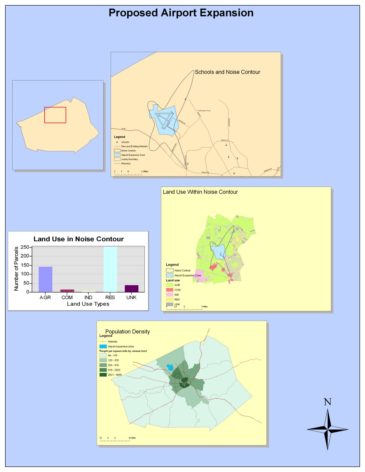
My experience with ArcMap was a struggle at first but I quickly adjusted to the format of the program. I struggled using the toolbars for the different portions of the tutorial. the first obstacle I ran into was getting the first noise contour map to fit in the 16 by 12 parameters. After I realized how to utilize the toolbar to adjust to this problem, I found the rest of the tutorial to be relatively easy. I can honestly say that without the tutorial, I would be completely lost on how to use ArcMap. Regardless, it was rewarding to utilize software that professional geographer's use on a faily basis. Although I created a very simple map, I still felt quite accomplished after finishing the entire tutorial. Making a map of the possible expansion of an airport made me realize the practical use of this technology and how it can better serve communities and society at large. I look forward to taking a more in depth look into this software.
I like the freedom I am given within ArcMap so that I can add some creativity to my map. There are various designs for compasses, scale bars, points and other elements within ArcMap. I could even change between various color schemes, which allowed me to further personalize my map. This lab showed me how amateur the "my map" feature on Google Maps was. Google maps only allows for visual representations, but doesn't allow the data input and personalization that ArcMap provides. Not only do I enjoy the creativity ArcMap gives me, but versatility too. I can calculate population density and other statistics. It's very useful for data calculations and translating numbers into visual representations. Also, the multilayer effect of ArcMap was useful because I could view different data separtely at my choosing.
The downfall of ArcGIS is that it's quite difficult to use and has a steep learning curve. I can honestly say that without the tutorial, I would be completely lost. Even going through the tutorial was difficult at first. It's definitely not as user-friendly as Google Maps. Considering it's so hard to use, it would be difficult to explain the map you created to someone unfamiliar with the technology. You would only be able to communicate your map's meaning to ArcGIS experts, as amateur map users would be severly confused by the intrinsic process of ArcMap.
Due to it's complexity, I feel like ArcGis will not be used universally or by users of differing neogeographical experience. It's primary market are geography experts who are experienced with it's capabilities. Therefore, ArcGis will never gain the mainstream popularity that Google Maps has, despite being more informative and interactive. Also, ArcGis cost money. No amateur map user would pay money to utilize ArcGis's advanced benefits when Google Maps will more than suffice for their needs. Thus, ArcMap simply can not exist in the universal market and will only be limited to use by experts in the field of geography.
Tuesday, October 12, 2010
Lab 3
View My Hometown in a larger map
The neogeography map above is a detailed map of my experiences as a child in my hometown, Chicago,IL. Neogeography allows amateur users to create their own personalized map with information both relevant and meaningful to them. The beauty of these personalized maps is that it allows creators to leave out unneeded and excess information. Therefore, all the information provided is at the creator's discretion and is more relative to their personal life. Another way neogeography is useful is by educating users about their surroundings. By mapping specific locations that are relevant to them, they become more aware of the area around which they are primarily focusing on. All of these aspects are what allow neogeography to be so useful.
While it does have many positives, neogeography also has its fair share of pitfalls. The greatest of these pitfalls could be putting blind faith in an amateur who created a map. Much like the website Wikipedia, anyone can log on to Google Maps and create and edit their own information. In neogeography, this could translate to unreliable information presented on the map. Amateurs using this technology are no where close to providing the valid information a trained professional can. Therefore, many of these amateur maps can not be taken as 100% correct as they may contain many defects and unreliable information. Also, these maps contain personal biases on what particular people find interesting and/or the best of a given category. For example, my opinion of what the best Italian restaurant may not be a shared sentiment amongst the majority of people. These biases must be taken into account when viewing someones map, as their opinions should not be taken as valid truths.
Despite theses pitfalls, neogeography gives amateur map users a medium to communicate their personal experiences and information relative to their life.
Tuesday, October 5, 2010
Lab 2
1. Beverly Hills Quadrangle
2. The adjacent quadrangles are Canoga Park, Van Nuys, Burbank, Topanga, Hollywood, Venice, Inglewood
3. 1995
4. National Geodetic Vertical Datum of 1929, North American Datum of 1927, North American Datum of 1983
5. The scale is 1: 24,000
6.
a) 1/ 24,000 = 5 cm/X
X= 120,000 cm
X= 1200 meters
b) 1/ 24,000 = 5"/X
X= 5* 24,000= 120,000"
120,000"/ 12"= 10,000 feet
1 mile= 5280 feet
10,000 feet/ 5280 feet= 1.89 miles
X=1.89 miles
c) 1 mile= 63,360 inches ==> 2.64 inches
d) 1/24,000= X/ 3km
1/24,000= X/ 300,000 cm
300,000 cm= 24,000(X)
X= 12.5 cm
7. 20 feet
8) a. 118deg 26min 30sec west (118.4416deg), 34deg 26min 15sec north (34.4374 degrees)
b. 118deg 29min 52sec west (118.4977deg), 34deg 31sec north (34.0086 degrees)
c. 118deg 24min 37sec west (118.4130deg), 34deg 7min 10sec north (34.1195 degrees)
9. What is the approximate elevation in both feet and meters of:
a) 580 feet/ 176.78 meters
b) 140 feet/ 42.67 meters
c) 630 feet/ 192.024 meters
10. UTM zone 11
11. 3,762,900 meters North and 361,500 meters East
12. 1000 * 1000= 1,000,000 meters squared
13.Elevation profile for the UTM Northing 3771000

14. Positive 14 degrees
15. The water in the stream is flowing Southwards
16. Cropped out image of UCLA on the topographic map:
Tuesday, September 28, 2010
Lab 1 Assignment

Source: http://www.alertnet.org/thenews/newsdesk/128110911696.htm
This map is from the article entitled "MAP: Pakistan's Flood Zone" from the Thomas Reuters Foundation.

Source: http://en.wikipedia.org/wiki/File:The_British_Empire.png
This map is from Wikipedia from the main page of "The British Empire."
 This map describes the overall political affiliations of the citizens of the United States based upon geographic regions. The red states are predominately Republican and therefore voted for John McCain, while the blue states are Democratic and voted for Barack Obama. I found this map interesting because it signifies a historic moment for our nation. This election was the first in which an African American was elected to be the President of the United States.
Source: http://www.google.com/imgres?imgurl=http://i70.photobucket.com/albums/i106/scooie0/Final2008USPresidentialElectionMap.jpg&imgrefurl=http://jutiagroup.com/2008/11/05/2008-presidential-election-maps-obama-takes-key-swing-states/&h=492&w=585&sz=55&tbnid=20IpZ3tUEcmZuM:&tbnh=114&tbnw=135&prev=/images%3Fq%3D2008%2Belection%2Bmap&zoom=1&q=2008+election+map&usg=__0r8-Pll2cHqe41-Z23BdbMHTqzA=&sa=X&ei=uFiiTJfHEYqmsQPP0qWJAQ&ved=0CCoQ9QEwBA
Google Images
Subscribe to:
Comments (Atom)